Friday, November 13, 2009

Reminder + Process: Coloring in Photoshop

=
First off, as a reminder, our very talented Seal has been invited to showcase her artwork at the Saida Glide fundraiser event tonight at Sugar Cafe (679 Sutter St. at Taylor) in San Francisco. There is a fashion show at 9:30, but the event goes from 7pm til 2am. We'll be there from 7 til at least 11pm, networking, trying to sell our art, drinking, and doing some drawing.


Seal will be selling some fine art archival prints (giclees) for $25 of two of her newest work , as well as the original painting for the swamp house for $325 (or for $375 framed). Monkey might also go guerrilla-style (or is it gorilla style?) and sell some small prints and stuff for kicks (he'll have to wait and see how things are there).

Hopefully you'll stop on by and say hi!

**********
So today's Saturday process post is by Monkey. He'll be briefly explaining the basics of coloring in photoshop.

Hi everyone! So today I'll be explaining a bit how to do color a scanned line drawing in Adobe Photoshop. Examples of work I've done (and stuff that is suited for this sort of digital painting are things like:
and Notice both are really graphic with mainly solid linework and flat color mixed in. The way one does this is you start with a line drawing (I tend to do mine in a sketchbook or on paper as I don't really like to draw digitally if I can help it) that you scan in. After you scan it in, I usually clean up the half-erased marks and play with the levels to get my lines darker.

Here's my cleaned-up line drawing for the Handmade Ho Down poster and flyer
.

You can see in the scan above that I actually didn't draw the flag logo yet...the logo was created the same way as I did the poster/flyer, but since it was already done I didn't want to redraw it, I left the top of the big flagpole off (I inserted it later digitally). Sometimes this is good if you already have an image that you're planning to work in - for me, leaving spots obviously blank is a good reminder that something needs to go there.

So here's where you start setting up PS to make coloring easier. Assuming all your lines are connected perfectly in your scanned drawing, you could just use the color bucket to paint large flat areas in your drawing. However, if you zoom in, you'll see that it'll eat into some of your linework, leaving it jagged at times. Thus, this is my preferred method. It's not quite as quick, but you'll get smoother lines.

What you do is first, right-click (or ctrl-click for mac mouse users) on the background layer (which should have your image in it if you opened it up in photoshop to start painting). Click on the "duplicate layer" and create a "background copy." Then, drag it on top of your background layer. Now, select your background layer and create a new layer between them. Select the background copy. In the photo below, it's labeled "Layer 1." Go to the little drop-down menu above the layers palette and change the layer property from "normal" to "multiply."
What multiply does is literally multiply the colors from that layer with the colors on the layer below it. Thus, any white space on your background copy will show pure color beneath it. Any blacks will show black. This allows you to paint on the sandwiched layer without affecting your original drawing. The only drawback to this is that you can't really use your paint bucket since this layer that you are coloring in is just an empty layer. However, like I said, it preserves your line quality, so it's almost like a coloring book where the black lines always stay on top of your coloring.

You could just create a multiply layer underneath the background layer, but I like to have a copy of the original drawing in case I need to make changes. This way, I can edit the drawing on my copied layer, and if I don't like it, I can always go back to my original background layer, make a new copy, and start from the original drawing.

In the screencap below, you can see which layer I'm painting on. Also, I felt it was prudent to point out the brush setting I use. Since I paint with a tablet (to be honest, I don't know how you can do digital art with a mouse), I have shape dynamics on, with size jitter at 0% and it being controlled by pen pressure. This way, the harder I press the fatter the line (to the max pixel size that my brush is set to), and the lighter I press the finer the line. This replicates brush control in real life - if you want to make a thinner line, you just use the tip of the brush. I also have the minimum diameter set to 0 so that I can use very very faint brushstrokes to make tiny, thin lines.
Also, note that I'm currently painting in RGB mode. This is great if you never plan to print out your illustration, but if you want to print it, BEFORE you start, change the mode to CMYK. Believe me, it'll make everyone happier.


So, after a lot of coloring and adding text and resizing things and moving things around, the little octopus guy turned out like this:
I ended up painting in the flag for the big logo, and replaced the hand-drawn SF Etsy flag with the actual logo. I also extended the pole and added the Etsy logo.

Anyway, that's it for now, and if you have any questions feel free to leave them in the comments and we'll get to them as soon as we can. Also, don't forget to show up to the Handmade Ho Down on December 3rd to meet us in person, check out our art, and see the grand premier of Monkey's new silkscreened ties! Thanks for reading!

Thursday, November 12, 2009

Come see Seal's art on Saturday!


This Saturday, November 14th, come and check out Seal's work in person at the Sugar Cafe from 7pm til 2am! Seal was invited to be a part of a group show put on by Saida, an organization that is working to raise awareness about the growing problem of homelessness in San Francisco and to raise funds to build a homeless shelter. Pretty darn spiffy, if you ask us!

There's even going to be a fireplace and a fashion show involved as well! There is a cover charge (that enters you into a raffle) if you are under 21, and if you are of drinking age, part of the profits from your booze will go to Glide, and awesome SF org fighting homelessness in the Tenderloin - plus there should be some great art for sale!

Seal will have a few pieces in the show (look for Eve Skylar's work) so definitely stop on by! Monkey will be on hand as well drinking and supporting the Seal.

Wednesday, November 11, 2009

Tetsuya Ishida


Monkey and Seal recently had the incredible pleasure of discovering the work of Tetsuya Ishida, a contemporary Japanese painter. The store that Seal works at recently started carrying a collection of his work and when she showed Monkey, he was literally speechless.

His work is hauntingly beautiful, commenting on modern Japanese life. His topics range from the life of a salaryman to consumption to alienation and loneliness. Each painting was a self-portrait of the artist in the thick of it. He recently died in April from a train accident which is suspected to be a suicide.


Truly a great talent that will be missed, Monkey feels like this collection of work by Tetsuya-san is super inspiring and invaluable to the Monkey and Seal library.

Tetsuya does what Monkey ultimately wants to do with his art. By combining social commentary, politics, creepiness, and magical realism, Tetsuya says something deeply profound that resonates with one's soul and stays with you.

While Monkey's work currently explores the same themes but with a more humorous bent while using the interplay between text and images, he wants to eventually create something as moving and powerful as Tetsuya.

Monkey and Seal both highly recommend checking out more of Tetsuya's work - it is a simply stunning collection that finds beauty in the horrors of contemporary Japanese life.

Monday, November 9, 2009

The Walt Disney Family Museum

The Walt Disney Family Museum: Seal does not take credit for the above image, it is the concept illustration from the official webpage. And for the record, Seal is not paid to endorse the museum, she just really liked it.
  • Architect: Page & Tumbull, San Francisco
  • Interior & Exhibit Design: Rockwell Group, New York;
  • A/V Production: Batwin+Robin, New York;
  • Tarrigo, Inc., Glendale, CA
Last Saturday, Seal went to The Walt Disney Family Museum in The Presidio of San Francisco, which just opened about a month ago. It was a very inspiring and fun adventure. Although Seal doesn't agree with the corporate conglomerate of what Disney is today, she still has a soft spot for Walt Disney's artistic vision. After all, he revolutionized and influenced many of the ways we do animation today. Seal admires Walt Disney's pioneering and resilient spirit. His old feature length animations (Sleeping Beauty, Bambi, Pinnochio, etc) and experimental films influenced Seal's decision to go into animation. Although Seal is now more into the production design, concept art, and illustration aspect of film and animation, the museum is made for all artists and humanists alike- not just animators. Walt Disney was a renaissance man- a producer, director, screenwriter, voice actor, animator, entrepreneur, philantropist, he did everything, and best of all, he was a big kid at heart.

The Museum, located in The Presidio, has 10 show rooms full of original and reproductions of photos, sketches, thumbnails, layouts, concepts, illustrations, and textual descriptions behind Walt's visions. Some of Seal's favorite rooms are when she got to see up close, some of the layout drawings and illustrations for Pinnochio, Snow White, Bambi, and Alice in Wonderland. The painted backgrounds looked like they were done in watercolor and some in gouache. Some of the small thumbnail concept illustrations were no bigger that the palm of a hand. They were quick, expressive, and effective. Some of the concept illustrations for Fantasia were done in oil pastel, a medium that Seal wants to try next. The final painted backgrounds for Bambi were done with oils on glass. Unfortunately, because of WWII and depleting resources, those beautifully painted glass backgrounds were scraped off to be re-used for the next animation. I believe we currently only have one remaining shot of the original oil painted background from Bambi in archive today.

One disappointment was that Seal was hoping to see more background paintings by Eyvind Earle and was really sad when they didn't have his book in the museum store. . .

Besides flat illustrations, there were also many video clips of Walt Disney acting out the scenes to his animation, he really understood storytelling and was a genius in conveying emotional impact. Seal believes that artists are secretly actors/storytellers too. Probably most surprising of all for Seal is that it had not been a smooth ride for Walt. He had encountered many obstacles in realizing his vision. Many people doubted him, doubted whether anyone would have wanted to pay to see an hour long cartoon. At one point, his popular animation series and animation staff was bought out by a middleman behind his back. It was during the train ride home after this crushing meeting, that he came up with Mickey Mouse, he said something along the lines of "this mouse represents my freedom." I am sure that Walt would be crying in his grave if he saw the corporate Disney of today.

As an artist, Seal admires Walt Disney's enduring struggle to do something no one has ever done before. To experiment, to really taste life, and bring it to the people - this, in essence, is what she got out of the museum.

If you are interested, you can find out more info at their offical webpage. The museum is located on 104 Montgomery Street, The Presidio, SF 94129. Tickets are $20 for adults and $15 for students with ID. It's a good idea to purchase tickets ahead of time online, they are timed and have an expiration date. Seal arrived late in the afternoon, and so only had 2 hours to look at 10 showrooms and still didn't get through the depth of it all, she is going back soon and is going to bring Monkey along.

Saturday, November 7, 2009

Seal's Process: Designing Shapes

Seal recently finished one of her animation background layout - a violin antique repair shop (above). She was inspired by the renown violin-making city of Cremona, Italy. She likes the shape of violins, but has never drawn one before, nor seen one up close. So in her process, she had had to research some of the essential shapes associated with a violin. Below are some of her sketch studies.

Every recognizable object has an essential shape, it's what makes them identifiable and separates a cow from a violin. Back when we were cave people and even today, our brain likes to quickly categorize shapes- "friend or foe- that is the shape of an edible fruit, or that is a lion I should run away from," "that is my friend across the street, or my boss coming down the hallway." So as an illustrator/artist, we have to make sure that we clearly communicate the shape of objects (if you want clarity). Sometimes as fine artists, we want to play with our audiences' expectations and create ambiguity, in which case, we can deliberately distort shapes.

It often takes several drawings for our brain-hand muscle coordination to get into sync in expressing the right line or curvature and shape. Below is the line drawing used for the final illustration. You can see that some of the violin shapes are good (recognizable, typical, relatively realistic) and some are a little off (perhaps too elongated, not having quite the finesse). It probably would take me another month of practice drawing the violin, to be able to draw them from memory.


Sometimes it is good to "push" the design of the shapes (as seen below). In the animation world, this "cartoony" style is called "wonky." Going "wonky" helps my brain to loosen up and to experiment on how far I can exaggerate the shapes of the violin while still keeping them recognizable.


Thinking about shapes is not only applicable to illustrators or 2d artists, when designing anything from jewelry, to bags, to hats, to hairpins, you want your products to be recognizabe, yet different from anything anyone else has done before. In order to do that, you have to start at the basic shapes. What makes a top hat different than a beret? Before anything else-- color, texture, material -- it inevitably boils down to their essential shapes.

Wednesday, November 4, 2009

Halloween 2009 - Rise of the Narwhals


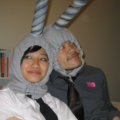
This Halloween, Monkey + Seal decided to go as narwhals. "Nar-what?" you might be asking. Well, narwhals are cetaceans (the Order which includes whales, dolphins, and porpoises). They live in the Arctic and have a huge (~2 meters long) tooth that sticks out of its face. Males mostly have the tooth, but some females have it as well. Some narwhals even have a double-extended tooth!

So Monkey wore his costume all day to work, and was often questioned as to what he was dressing up as. This is natural, as he does look pretty silly, and by silly, we mean awesome. Many people assumed he was a unicorn, which is actually pretty coincidental as narwhal teeth were often traded in the olden days as unicorn horns by sly tradesmen who would get more than their weight in gold for them. These teeth were thought to confirm the existence of the mythical unicorn. So, just as the tooth of a narwhal was mistaken for the horn of the unicorn, Monkey's costume of a narwhal was mistaken for a costume of a unicorn.

Monkey created the costume by finding two gray hooded sweatshirts at the local second-hand and thrift stores. He then cut the hoods off but left part of the shoulders intact. This allowed for the tucking under of the hood into a shirt or jacket, which gave it more stability.

The horn was created by a larger cardboard tube and a toilet paper tube that had been crushed and tapered on one end. The two tubes were duct-taped together, then Monkey sewed the cardboard into the hole he had cut on the top of the hood. By cutting tabs into the base of the horn and poking holes with an awl, he was able to created a flanged horn that could be sewn in.

After sewing the horn to the hood, Monkey gessoed the horn and tape, and then painted the spiral pattern with acrylics.

All in all, Monkey and Seal had a great Halloween, and hope that you did as well. If you had a really great costume, we'd love to see it! Email it to us at info (at) monkeyandseal.com and we'll post some up on the end of this post for the world to see!

Tuesday, November 3, 2009

Art, Video Games, and Procrastination

Today Monkey will talk a little bit on art and time and procrastination:

So if you've ever asked me "how busy are you," I'll usually go into some long-winded tirade on working 5 days a week, going to school 2 days a week, and then fitting in art, Monkey + Seal business stuff, planning a craft show, trying to write a novel, a zine/book on wedding invitations, get freelance illustration/graphic design/craft work, and spending time with Eve. Actually, I guess that is the tirade. Anyway, yes, I do a lot, and I naturally keep piling things up on my plate of things to do. Ask Eve and she'll tell you that I have problems just relaxing and not doing anything.

But, you don't care about any of that, you just want to know how to make more time for your art. Well, to be perfectly blunt about it all, you have to learn to prioritize your life. If you want to make it as a successful artist, you have to constantly be drawing. If you don't draw, then you need to be rehearsing your violin, or researching different materials to sculpt, or you need to be making soap as often as you can. Even I often say "oh, I don't have time," but really, you have a choice. If you really want something (like to hang out with a friend or to see a concert), you need to make time for it. Sometimes, this will lead to sleepless nights where you're exhausted at 6am but you still need to fix the colors in your print file that's due in three hours.

However, I find that the greatest amount of time is time spent procrastinating. From browsing blogs to playing facebook games (like that damn Vampire Wars and Bejeweled Blitz), I truthfully waste a lot of time. I also play Improbable Island (if you decide to play, sign up from that link I gave you and I'll get referral points...wait, what the hell am I doing?), which is another great time sink.

The point of the matter is that I probably spend at least an hour or two playing those dumb games per day. I also spend maybe 30 min to 1 hr reading every day. That adds up to up to three hours of my day that isn't taken up by work or art or anything productive. Now I'm not saying that you need to give up your facebook games, or stop reading, or anything like that. But it's all about management. Play less. Read for only 15 min a day. Cut back. This frees up a surpising amount of time. I used to play World of Warcraft, and as much as I love that damn addicting game, I would lose myself in it for hours at a time. Eventually, I just had to cancel my account as if I wanted to keep making art at a decent level I had to give it up. I'm now working on cutting back my online time to only an hour per day.

So games aren't the end of the world - if I didn't have a little bit of a stress-reliever, I'd go nutso. But it's all about moderation.

If you can't kick the habit (or even if you do), the trick then becomes to maximize the use of idle time. If you have a bus ride to and from work or school, if you have a seat, you can use that time to draw. Or, if you don't want to try and sketch on the shaky bus, stay up an extra 15 minutes to draw the night before and sleep on the bus ride. If you have a 15 minute break at work, are you just hanging out outside your store, or are you in your break room sketching out ideas for paintings? Seal talked about this earlier - make good use of your time.

One of our instructors at AAU managed to get his BFA in Illustration while raising a family and working. Having to take care of a child while taking four classes and working is crazy beyond anything I could ever do, but that shows the determination and excellent time management. As so many professional artists have told me: "draw all the time."

I thought this was sort of ridiculous at first, but as time has progressed, I've realized the truth behind that statement. Yes, you have to be sustainable, and you have to take care of yourself, but if you really want to make it as a commercially-viable professional artist, you have to take the time and prioritize your art.

Looking at yourself and your behavior objectively is never easy, nor is it fun. But you have to figure out what you really want in life, and what you are willing to do to get it. Do you want to be the biggest painter out there? Then paint. What do you want more in life? Getting epic purples in WoW or getting into a gallery? Time is fleeting, so it's up to you to choose wisely.