 =
=First off, as a reminder, our very talented Seal has been invited to showcase her artwork at the Saida Glide fundraiser event tonight at Sugar Cafe (679 Sutter St. at Taylor) in San Francisco. There is a fashion show at 9:30, but the event goes from 7pm til 2am. We'll be there from 7 til at least 11pm, networking, trying to sell our art, drinking, and doing some drawing.
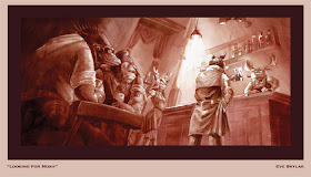
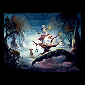
Seal will be selling some fine art archival prints (giclees) for $25 of two of her newest work , as well as the original painting for the swamp house for $325 (or for $375 framed). Monkey might also go guerrilla-style (or is it gorilla style?) and sell some small prints and stuff for kicks (he'll have to wait and see how things are there).
Hopefully you'll stop on by and say hi!
**********
So today's Saturday process post is by Monkey. He'll be briefly explaining the basics of coloring in photoshop.
Hi everyone! So today I'll be explaining a bit how to do color a scanned line drawing in Adobe Photoshop. Examples of work I've done (and stuff that is suited for this sort of digital painting are things like:
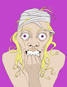 and
and 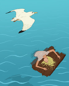 Notice both are really graphic with mainly solid linework and flat color mixed in. The way one does this is you start with a line drawing (I tend to do mine in a sketchbook or on paper as I don't really like to draw digitally if I can help it) that you scan in. After you scan it in, I usually clean up the half-erased marks and play with the levels to get my lines darker.
You can see in the scan above that I actually didn't draw the flag logo yet...the logo was created the same way as I did the poster/flyer, but since it was already done I didn't want to redraw it, I left the top of the big flagpole off (I inserted it later digitally). Sometimes this is good if you already have an image that you're planning to work in - for me, leaving spots obviously blank is a good reminder that something needs to go there.
So here's where you start setting up PS to make coloring easier. Assuming all your lines are connected perfectly in your scanned drawing, you could just use the color bucket to paint large flat areas in your drawing. However, if you zoom in, you'll see that it'll eat into some of your linework, leaving it jagged at times. Thus, this is my preferred method. It's not quite as quick, but you'll get smoother lines.
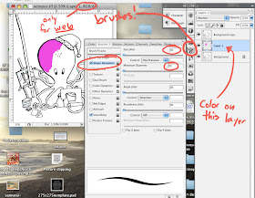
What you do is first, right-click (or ctrl-click for mac mouse users) on the background layer (which should have your image in it if you opened it up in photoshop to start painting). Click on the "duplicate layer" and create a "background copy." Then, drag it on top of your background layer. Now, select your background layer and create a new layer between them. Select the background copy. In the photo below, it's labeled "Layer 1." Go to the little drop-down menu above the layers palette and change the layer property from "normal" to "multiply."
 What multiply does is literally multiply the colors from that layer with the colors on the layer below it. Thus, any white space on your background copy will show pure color beneath it. Any blacks will show black. This allows you to paint on the sandwiched layer without affecting your original drawing. The only drawback to this is that you can't really use your paint bucket since this layer that you are coloring in is just an empty layer. However, like I said, it preserves your line quality, so it's almost like a coloring book where the black lines always stay on top of your coloring.
You could just create a multiply layer underneath the background layer, but I like to have a copy of the original drawing in case I need to make changes. This way, I can edit the drawing on my copied layer, and if I don't like it, I can always go back to my original background layer, make a new copy, and start from the original drawing.
In the screencap below, you can see which layer I'm painting on. Also, I felt it was prudent to point out the brush setting I use. Since I paint with a tablet (to be honest, I don't know how you can do digital art with a mouse), I have shape dynamics on, with size jitter at 0% and it being controlled by pen pressure. This way, the harder I press the fatter the line (to the max pixel size that my brush is set to), and the lighter I press the finer the line. This replicates brush control in real life - if you want to make a thinner line, you just use the tip of the brush. I also have the minimum diameter set to 0 so that I can use very very faint brushstrokes to make tiny, thin lines.
Also, note that I'm currently painting in RGB mode. This is great if you never plan to print out your illustration, but if you want to print it, BEFORE you start, change the mode to CMYK. Believe me, it'll make everyone happier.
So, after a lot of coloring and adding text and resizing things and moving things around, the little octopus guy turned out like this:
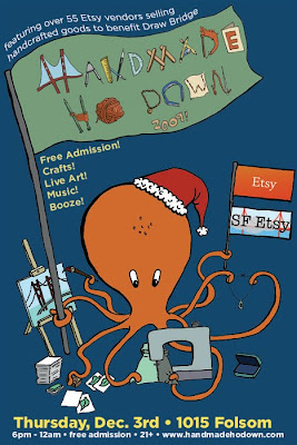 I ended up painting in the flag for the big logo, and replaced the hand-drawn SF Etsy flag with the actual logo. I also extended the pole and added the Etsy logo.
Anyway, that's it for now, and if you have any questions feel free to leave them in the comments and we'll get to them as soon as we can. Also, don't forget to show up to the Handmade Ho Down on December 3rd to meet us in person, check out our art, and see the grand premier of Monkey's new silkscreened ties! Thanks for reading!


No comments:
Post a Comment