Friday, April 9, 2010

Mark McDonnell = uber


We recently stumbled upon this video of Mark McDonnell, one of Disney's badass artists, going over how to warm up for gesture drawings. His blog is also very informative with links to great sites, other videos, and everything he has to say is pretty spot on.

As intimidating as his gesture drawings are (you KNOW this dude has studied how to do pirate footwear), it is also reassuring to know that the professionals have to keep their game sharp as well. Like my instructors always told me at the Academy - the major difference between a professional and a student is the mileage (ie hours spent on art). Thus - keep on drawing!

Also, Monkey + Seal will be heading off to a wedding this weekend, so no Saturday post this week! Sorry!

Wednesday, April 7, 2010

The World of Jasper Morello


Tonight, Monkey re-watched "The Mysterious Geographic Explorations of Jasper Morello." This animated short was a 2005 Academy Award Nominee for best Animated Short. I highly recommend checking it out if you get a chance, as the animation is simply stunning.

An interesting stylistic mix of rendered 3D mixed with paper-cut-out-like silhouettes, the first time Monkey watched this, he was hooked. He recently visited the Jasper Morello site and was pleased to find out that there (in theory) are more shorts slated to be produced.

All in all, Monkey freely admits that this film was a huge inspiration for his book arts project of his silkscreen portfolio class last Fall. After a lengthly lack of posting, hopefully he will put scans of the project up very soon. In the meantime, if you can get your hands on the 2005 Academy Awards shorts program, do so now! Most of the shorts are great!

Monday, April 5, 2010

AAU Print exchange

Monkey is taking part in the Academy of Art University's 2010 Print Exchange! He is very excited to receive prints from 29 other artists in exchange for his humble 3-color serigraph that he's made. To honor the fact that we completely forgot to do a process post yesterday, Monkey wanted to share a bit about the way that the prints tend to change from concept to actual execution. He's pretty sure that's not what's "supposed" to happen, but he doesn't care and likes that bit of uncertainty anyway. Take it away, Monkey!

So here's the original illustration, done by scanning in the background paper, and using photoshop to do the coloring:
And here's the final print (although the top green tape needs to be trimmed off):
As you can see, a lot can happen between the master sketch to the actual print. One thing I realized is that because I was printing on lokta paper, the pink vegetable dye actually seeped into my white paint, thus the stripes still show through. This gives it a sorta ghostly effect, which at first I wasn't into, but I think it reinforces the concept of being jailed by the expectations and fantasies via pornography (which is why I chose the striped paper in the first place...pink jail bars anyone?).

Also, I added a lot of line work, as when I was making the screens, I ended up wanting to sculpt the form of the woman's face a bit more. The pale blue made a good shadow, but I still wasn't happy, and after sketching out a new version with the linework, I decided it should stay for the actual print.

Finally, when I started printing, I wasn't 100% sure that I knew what I wanted the woman to be thinking. After talking it over with Eve and Carrie-Ann (who also was working on her print exchange print), I decided to go with the "*yawn*" as it makes the print more open-ended than I originally I was thinking of making it, and it also makes it funnier.

I hate it when people say "the new caption was better than what I thought originally" but never tell you what they were thinking, so here are the other possible captions:

-"I'm faking it for all my fans out there"
-"I'm faking it all for you, baby"
-"I wonder what's on tv"
-"to all my fans: I'm actually faking it"

If you disagree and would have rather seen a different caption: too bad!

Friday, April 2, 2010

Wedding Invites Day 3: Bella Figura and Cici New York

To end our week of wedding invitations, Monkey has decided to go with two of the leaders in the luxury wedding invitation design: Bella Figura and Cici New York.

Bella Figura is one of two (the other being Smock) wedding invitation companies that has stemmed from the ever famous (at least among letterpress printers) Boxcar Press. They are super eco-friendly, and are based in Syracuse, New York.

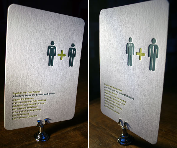
To be perfectly honest, I was a bit pissed off when I first went to their site, as they have the classic man and woman bathroom icons made into same-sex wedding invitations (I also had that idea for Little Yeti, and will just have to do it differently).

Their design sense is really strong, and they take some of the repeating themes seen in wedding invitations and spice it up a bit. Their use of color is also pretty boss, and overall, they're just a damn good shop.
Finally, I'll close off the week with custom design superstar, Cici New York. Let me say this right now- when it's time to print my own wedding invitations, I'm sure as hell designing them myself (with my lovely fiance'), as there is really no good excuse for a visual artist not to design their own invites. However, if there was a designer that I would trust to do a frickin' amazing job, it would be Cici (well, maybe Camille Rose Garcia, Tara McPherson, or Tomer Hanuka, but they don't usually do weddings like Cici does..). Anyway, I'll stop gushing and just say that if you have a large budget for wedding invitations, and want totally custom awesomeness (and don't want to go through Little Yeti), Cici is the way to go. I'll stop talking and just show you all the eye candy.


Thanks for stopping by during wedding invitation week! I hope you enjoyed taking a look at some of my personal inspiration for when I design wedding invitations, and be sure to check out all the different sites!

Wednesday, March 31, 2010

Wedding Invites Day 2: Ajalon Printing & Design + Paper Source

Hi all! So today, as part 2 of our wedding invitation week, Monkey + Seal will be doing a quick review (as requested) of Ajalon Printing & Design, a letterpress, offset, and digital printing and design studio located in Santa Rosa. Additionally, we will be taking a look at Paper Source, and the wedding invitation printing they have to offer.


After looking over the samples he was sent, Monkey was definitely impressed with the printing quality - sharp edges, good registration, nice color. Monkey was a big fan of the Sakura invitation, which at first glance looks like something digitally printed with a gradient, but upon closer inspection is actually a half-tone gradient letterpress printed. Nice!

Their website is also pretty smooth and easy to navigate around. Finding quotes was quick and easy - just how we like it. You can pick a card size, number of ink colors, quantity, and printing method and get a quick quote like that! Definitely cool.

Another big plus to Ajalon is that they have tons of paper options to choose from, including Monkey's favorite letterpress paper, the duplexed 600 gsm 100% cotton Crane Lettra paper. Ooooh, such sweet papery goodness! Granted, printing on the 600 gsm Lettra is more expensive, but woof, if you can afford it, it is definitely worth it!


Our other review for the day is Paper Source. Based out of Chicago, Paper Source is now 33-stores wide and growing. They offer letterpress, digital, and engraving printing services, as well as thermography through Crane & Co., William Arthur, and Vera Wang.So full disclosure on this one: Monkey's day job is for Paper Source (but he doesn't get any commission for invite orders). He won't say which one, but he does sell these wedding invitations day in and day out, so he's super familiar with them. That said, Paper Source's website for invitations is pretty comprehensive in terms of being able to completely order online (assuming you're going with one of the designs without too much customization).
Monkey really likes the fact that they started printing in Beet ink (with Black, shown below in the Victorian Garden design) and it looks pretty damn good with some of the darker colors like Black and Night.
Paper Source is one of the cheapest print shops Monkey has found if you are a customer interested in buying a design, so if you are on a budget, PS is pretty tough to beat. That said, there are other letterpress shops that are less expensive, but that also assumes that you are a designer with the ability to do things like color separate, etc., etc.

Paper Source prints on a 20% cotton, 30% PCW, 300 gsm paper that is pretty nice and environmentally friendly, but also doesn't feel quite as nice as Crane Lettra or Rives BFK.

If you want envelope printing, depending on what paper stock you choose, can go from affordable to completely ridiculous, so that's one major issue PS has going against it. Other than that, Monkey will admit that Paper Source has a good balance of value, design, and quality.

So there you have it, round 2 of Wedding Invitation Week here at Monkey + Seal. See ya on Friday!

Monday, March 29, 2010

Wedding Invites Day 1: Elum and Dutch Door Press

Today is the first post in a series of three about wedding invitation design! Woo! Our first design studio Monkey would like to bring to your attention is the fabulous Elum Designs located in San Diego, and the second studio is Dutch Door Press, located right here in weather-unpredictable San Francisco. First up is Elum!


When Monkey first saw the letterpress designs for wedding invitations by Elum, he was immediately smitten, and wanted a copy of all of the designs. His favorites are the Poster suite, and Butterfly Drift, which are shown immediately below.


Really, the Butterfly Drift invitation is even more ridiculously stunning, but I will say that it is a bit annoying to have to download all the pdfs to see the entire suites, but if you have the time and patience, it's worth it. Really though, seeing them online is nothing to getting to see the actual cards in person, so if your friendly neighborhood wedding invitation retailers sells Elum, check them out! They're not completely over-the-top expensive, but a 2-color card and unprinted envelope will easily run you $700+ for a quantity of 100, so they're not cheap either.

Dutch Door Press, run by the fabulous Mara and Anna, is a cute little letterpress shop in the Haight specializes in (you guessed it) whimsical designs with a very Dutch feel.

While, like with Elum, you're also going to pay for their premium designs, they are extremely friendly to work with and are great printers. They have a good selection of designs, and if you aren't into some of the color choices (some are just not my bag), if you go to their wedding gallery and select a design you like, there are multiple color ways you can see, and a handy-dandy pricing calculator that works wonders. Very nice, ladies!
On top of all the designs available to choose from, I'm personally a big fan of some of the custom work that they've come up with. Anna is a talented illustrator, and the custom section has some other great modern designs!

Whew, so that wraps up Day 1 of the wedding invite series. We hope you'll join us again on Wednesday for part 2!

Saturday, March 27, 2010

Saturday Process: The monster lady


Today's process post is by Monkey, who will take you through a coloring of a illustration of some monster lady (who is holding a fish).

Hi everyone! So today I decided to work a bit more details than I usually do in terms of my pencils/linework. I started out in my sketchbook with a HB pencil, and roughed out this drawing. I then had Eve add something, and she chose to just add a little fish. Honestly, I was hoping she would do an environment for the character (since she's amazing and I'm not as experienced as she is), but I got a cute fish, so I'll take it.
After scanning the pencil drawing in, I then proceeded to multiple the drawing layer, and create a new painting layer underneath. I then started in blocking in color, not worrying too much about light and darks (as I took care of the basic lighting via pencil), and more about overall color harmony. Everything is a bit pastel-like at this stage, as I don't want to get too saturated yet, and since I'm dealing with a triad (yellow hair, blue jeans, pinky (ie red) skin and lips), I have to be careful not to make it clash too much.
Next, I throw in a gray gradient to give it a sense of a light source, which has to match with the light source that I first indicated by the shading of the character. I also decide to give her green eyes and blood-soaked red lips.

I want to give the illustration a bit of a mood, so I decide that the values are all waaaay too high key (ie. all the values are really light) and thus I play around with contrast, brightness, and levels to bring it down quite a bit. I add some blood splatters to her shirt, fish, and teeth.


Next, unfortunately, comes the "and then you suddenly have a cake" part, as I got a bit carried away fixing things and I forgot to take more intermediate steps of the painting. At this point, I realized that with the way I lighted the monster's body, her shadow should have been going behind her, not in front of her. Thus, I had to correct that, make a lot of the values darker, I threw in some wood textures behind her for a background, created a plane change where the wall hits the ground, added an overhead lamppost (outside of the picture plane), and hid more of her body in shadow.


So there you are, from pencil sketch to sort of a finish. In reality, I need to either move the light source over (to justify why so much of her face is lit up), or make more of her face and body darker. Also, the value change from light to shadow on her feet, leg, and arms could be made more apparent in order to really put the rest of her body in the shadows. Well, an artist's job is never really done - generally you just run out of time, motivation, energy, inspiration, or money, and that's when you call it a day.

Hope this was helpful and interesting, and thanks for reading!