Showing posts with label ri.s.k.. Show all posts

Monday, April 19, 2010

7 Steps to Playing a Much Bigger Game

So Monkey has been on a bit of an entrepreneurial kick this past week, and as he types this, he's been feeling a twisting pang in his chest. Fortunately, it's not angina, but the feeling of a realization that is so profound and life-altering, that it is hard to put it into words. It's the feeling (Monkey imagines) of standing on a high-dive platform, really, really high up, with the (what looks like) a tiny tiny pool down beneath you. You start to bounce a bit to get into the swing of things, and then you realize that if you try to stop the bounce, you're totally going to lose your balance and fall. But if you just take a big jump, you're going to get enough spring to fling you through the air.

The trick is to just let gravity do its thing and move you along. To be a bit more personal, here's Monkey:

To be honest, this feeling is scary. I first thought "what the f is wrong with me?" but then I realized that it's the life-altering slap in the face that I needed. Being able to finally "get it" - that really my own fear is what has been holding me back all these years is both relieving as well as frightening. It feels like a huge weight has been lifted off my shoulders, but at the same time I feel exposed and vulnerable, as knowing that I've been hiding behind my fear and insecurities, I really have been at fault for holding myself back.

I've heard this many times, in many various forms, but the pdf. I just read touched something in me that just shook me to my core. Now, for a few quick disclaimers. 1. I was so f'ing in to this little mini e-book that I immediately signed up for the affiliate program, so if you ever buy something or anything, we'll get a cut of it. 2. Dave Navarro, the author who wrote "7 Steps to playing a much bigger game," might not be for everyone as he's definitely blunt and motivating in a "get your ass up and go" sort of way. However, if you, like me, need a bit of a heavy hand sometimes, then this is definitely for you.


Some of my fav quotes from the guide:

"Yeah, life is difficult. It really is. But it seems much more difficult than it really is because society is training you to think that it should be easy. Microwave popcorn, drive-throughs, magic pills and instant downloads have conditioned us to expect everything to be easy and push button and if it's not, then oh-crap-what-is-wrong-with-me-I-am-such-a-failure."

"Imagine: You know CPR well enough. Someone stops breathing, and what do you do? Do you start asking yourself if there are better CPR practitioners than you? Do you wonder if your certification came from a prestigious enough teacher? Or maybe you have no certification at all, someone just showed you how to do it (correctly)? Are you going to dredge up every loser feeling you've had about yourself and dwell on that while that person slips off into the great unknown?
Hell no. You're going to get on your knees, do that CPR thing, and save that person's life. Without a second thought. Because the situation calls for value, and you have value to offer."
Definitely a bit brusque, Dave's writing really hits home for me, though, and has inspired me to really start working past my fear and taking action, regardless if it ends up in failure or success, as either way, it won't really be that bad.

I highly recommend signing up for his free email newsletters in order to get downloadable access to all the free pdfs he has to offer - all of which come with little worksheets that will help you get on your way to stepping it up another notch.

Anyway, as I've been doing more and more reading, I'll definitely be posting more and more awesome other writers/bloggers/coaches/advice/etc. about making it as a creative and chasing the dream. But for reals, check out Dave's stuff, and let me know what you think - hopefully it'll give you the kick in the pants you need to get out there and change the world.

Wednesday, March 10, 2010

Paper Hat Productions Features: Monkey + Seal

Only 2 days left until the Out of Place Art Riot Extravaganza!

As the curators and participants in the upcoming Out of Place group show, it's time to feature: Monkey + Seal :P

First off is the ever talented Eve Skylar (aka Seal) who is an amazing painter/concept artist/illustrator who is 50% of the Paper Hat Production team.

Hailing originally from Long Beach, California, this feisty artist cites classic literature, contemporary Japanese environment artists, and social issues as her inspiration.

Using extensive reference and research, Seal meticulously paints her captivating backgrounds, often with a sense of mystery and loneliness. She'll be the first to tell you that her paintings (along with research) have taken upwards of 50 hours to complete, but all that time is definitely worth it!

The other 50% of Paper Hat Productions is Rick Kitagawa (aka Monkey), who is an painter and illustrator that looks to pop culture, internet memes, and issues that affect the Asian American population as inspiration for his often humorous critiques on life.

Examining the interplay between text and image, Rick often enjoys giving a voice to the subjects of his paintings, whether it be inanimate objects, mythical creatures, or figures who are sometimes obviously upset with the way they are painted.

Additionally, as a printmaker, Rick enjoys exploring different mediums, and his combination of screenprinting with interactive sculpture will be on display at the gallery.

We'll see you in a few days!

Saturday, January 9, 2010

Process: Designing and Finding Inspiration Everywhere

This is Monkey here, and today I'll be talking about the design of my personal business cards which led to a new diptych of paintings.

So first off, for whatever reason, whether it be the creepiness or the iconography or just weirdness, I've always associated myself with skulls. My old logo was something like this:
So it was natural that when I was designing ties, I came up with this:
So, I ended up designing the front of my business card to look like this:
Using a scan of the original tie design, I changed up the crossbones to be paintbrushes, added a splatter texture that I created a while back by soaking a brush in ink and just going at a large sheet of paper. After scanning and saving it, I now have a really awesome, natural-looking texture that I can whip out whenever I need that grunge look.

So then, I realized that I probably should put a photo of my painting on my business card, since a)that's what most artists do, and b)it makes sense to show off your work. However, I was torn as I really liked the pink and black design with the skulls and the "create or die" underneath it (a motto I plan to live by). Then, inspiration hit. Duh, why don't I just do a painting of the "create or die" dealy? (slaps forehead). Duh.

In my paintings (most of which are not up on my website yet -_- ) I deal with the exploration of the hierarchy between text and image, realism and graphic representation, order of words altering meanings, and the nuances of language. So, it came to me that by having the order of the words be "create" then "die," it gives the reader the idea that I'm advocating the creation over the dying. I thought it would be then interesting to use almost the same image but switching the words around. I also wanted to keep the numbers of letters the same in the first and second word, so then I did another painting that says "death or art."

Believe it or not, these are the same color..stupid weird lighting in my apartment..

The top photo is longer cuz I formatted it for business cards and had to get clever with the stamp tool in photoshop to extend the canvas border.

I then decided to use a contrasting color (well, not a perfect contrast, but you get the point) on the back. I brought in the original grunge text, added some hand-drawn elements, and here you've got the back of my card:
Anyway, I guess what the point of all this was to highlight how what seem like problems or setbacks can be the best (although unlikely) place to find inspiration. I ended up not having to compromise my original design and ended up with not only a business card design but also two new paintings. Often I get the biggest inspiration when I'm frustrated or completely at my wit's end when dealing with a problem.

Instead of trying to bash your way through problems (as tempting as that may be, especially for me), I find that staying fluid and constantly looking for new ways of viewing your problem can lead to unexpected and novel solutions. Also, I like to think across mediums. From what started as a tie design led to a new logo which led to a new business card which led to two new paintings. Think about some cool doodles you already have. Maybe that's your next painting or postcard design. Anyway, I hope this was informative and helpful!

Saturday, November 21, 2009

Another sneak peek at the ties!

Sorry this is such a short post, but we just wanted to share with you some of the new colorways that Monkey found are successful. He hope you agrees! Once again, they'll be making their big debut at the Handmade Ho Down!

Here's the Hazmat design in black on charcoal (for those who don't really go with the Radioactive Green color) and the Skull N Bones design in black on silver (for you non-pink people).

Monkey will be spending a good part of next week working on the ties (with more tie colors!) to bring a full selection of awesomeness to the Handmade Ho Down. Mark your calendars, and if you are interested in pre-ordering for a discounted price, let us know!

Monday, November 16, 2009

Did you make that tie yourself?

So at Monkey's dayjob, he is forced to wear a collared shirt and slacks. Being the snazzy Monkey he is, he likes to wear button-ups and ties. However, Monkey doesn't like dress codes, and so he was thinking of ways to personalize his very corporate appearance. Thus, he figured that if he made some kick-ass ties, then he could still be himself while staying within the dress code.

Thus, he started thinking about ties as an art format and came up with some designs that he thinks are pretty spiffy. He found a place that sells flat-colored ties, and is working to perfect screen-printing them. His grand debut of his line of ties will be at the Handmade Ho Down! Thus, if you want to see ALL the ties before everyone else does, it's a great opportunity. They will be online shortly after the event in the lovely Monkey + Seal Etsy Shop.

Anyway, since pictures usually speak louder than words, here are some sneak peaks at the ties! These are going to be the main colorways for these three designs! Monkey is still experimenting with different color inks, ties, and a few more designs. And although Monkey wears these super-bright colors daily, he will also be printing on some more neutral colors, for those of you who are a bit less wild. Enjoy!

Friday, November 13, 2009

Reminder + Process: Coloring in Photoshop

=
First off, as a reminder, our very talented Seal has been invited to showcase her artwork at the Saida Glide fundraiser event tonight at Sugar Cafe (679 Sutter St. at Taylor) in San Francisco. There is a fashion show at 9:30, but the event goes from 7pm til 2am. We'll be there from 7 til at least 11pm, networking, trying to sell our art, drinking, and doing some drawing.


Seal will be selling some fine art archival prints (giclees) for $25 of two of her newest work , as well as the original painting for the swamp house for $325 (or for $375 framed). Monkey might also go guerrilla-style (or is it gorilla style?) and sell some small prints and stuff for kicks (he'll have to wait and see how things are there).

Hopefully you'll stop on by and say hi!

**********
So today's Saturday process post is by Monkey. He'll be briefly explaining the basics of coloring in photoshop.

Hi everyone! So today I'll be explaining a bit how to do color a scanned line drawing in Adobe Photoshop. Examples of work I've done (and stuff that is suited for this sort of digital painting are things like:
and Notice both are really graphic with mainly solid linework and flat color mixed in. The way one does this is you start with a line drawing (I tend to do mine in a sketchbook or on paper as I don't really like to draw digitally if I can help it) that you scan in. After you scan it in, I usually clean up the half-erased marks and play with the levels to get my lines darker.

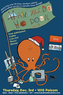
Here's my cleaned-up line drawing for the Handmade Ho Down poster and flyer
.

You can see in the scan above that I actually didn't draw the flag logo yet...the logo was created the same way as I did the poster/flyer, but since it was already done I didn't want to redraw it, I left the top of the big flagpole off (I inserted it later digitally). Sometimes this is good if you already have an image that you're planning to work in - for me, leaving spots obviously blank is a good reminder that something needs to go there.

So here's where you start setting up PS to make coloring easier. Assuming all your lines are connected perfectly in your scanned drawing, you could just use the color bucket to paint large flat areas in your drawing. However, if you zoom in, you'll see that it'll eat into some of your linework, leaving it jagged at times. Thus, this is my preferred method. It's not quite as quick, but you'll get smoother lines.

What you do is first, right-click (or ctrl-click for mac mouse users) on the background layer (which should have your image in it if you opened it up in photoshop to start painting). Click on the "duplicate layer" and create a "background copy." Then, drag it on top of your background layer. Now, select your background layer and create a new layer between them. Select the background copy. In the photo below, it's labeled "Layer 1." Go to the little drop-down menu above the layers palette and change the layer property from "normal" to "multiply."
What multiply does is literally multiply the colors from that layer with the colors on the layer below it. Thus, any white space on your background copy will show pure color beneath it. Any blacks will show black. This allows you to paint on the sandwiched layer without affecting your original drawing. The only drawback to this is that you can't really use your paint bucket since this layer that you are coloring in is just an empty layer. However, like I said, it preserves your line quality, so it's almost like a coloring book where the black lines always stay on top of your coloring.

You could just create a multiply layer underneath the background layer, but I like to have a copy of the original drawing in case I need to make changes. This way, I can edit the drawing on my copied layer, and if I don't like it, I can always go back to my original background layer, make a new copy, and start from the original drawing.

In the screencap below, you can see which layer I'm painting on. Also, I felt it was prudent to point out the brush setting I use. Since I paint with a tablet (to be honest, I don't know how you can do digital art with a mouse), I have shape dynamics on, with size jitter at 0% and it being controlled by pen pressure. This way, the harder I press the fatter the line (to the max pixel size that my brush is set to), and the lighter I press the finer the line. This replicates brush control in real life - if you want to make a thinner line, you just use the tip of the brush. I also have the minimum diameter set to 0 so that I can use very very faint brushstrokes to make tiny, thin lines.
Also, note that I'm currently painting in RGB mode. This is great if you never plan to print out your illustration, but if you want to print it, BEFORE you start, change the mode to CMYK. Believe me, it'll make everyone happier.


So, after a lot of coloring and adding text and resizing things and moving things around, the little octopus guy turned out like this:
I ended up painting in the flag for the big logo, and replaced the hand-drawn SF Etsy flag with the actual logo. I also extended the pole and added the Etsy logo.

Anyway, that's it for now, and if you have any questions feel free to leave them in the comments and we'll get to them as soon as we can. Also, don't forget to show up to the Handmade Ho Down on December 3rd to meet us in person, check out our art, and see the grand premier of Monkey's new silkscreened ties! Thanks for reading!

Friday, October 9, 2009

Monkey + Seal Giveaway Raffle!

Hey everyone! Monkey + Seal recently saw our first holiday card display (yikes!) and got in the gift-giving mood. Sooo, we have decided to hold our first raffle! Yay for you! Yay for free stuff! What can you win? Good question!

The prizes are:
3rd place - A free copy of The Monkey Zine!
2nd place - A free copy each of The Monkey Zine, The Bad Date Zine Issue 1 & Issue 2!
1st place - Your choice of any single print of Seal/Eve's that's in the shop!
Grand Prize - Either a free "Cryptids at Night" serigraph by Monkey/Ri.S.K. (value of $75) or a $45 gift certificate to the store.

Woo hoo! We're giving away over $100 worth of stuff! If you're as excited as we are, know that the contest is going to end this Sunday at 11:59 PM PST, with winners announced here at the blog on a special Tuesday post!

Here's the scoop as to how to enter:
Fill out our survey for 5 entries!
Any purchases on our Etsy site from Friday til Sunday night (11:59pm PST) gets 5 entries!
You get 2 entries for following our blog!
Fan us on Facebook for 2 entries!
You get 2 entries for signing up for our newsletter (from the sidebar on our main site).
You get 1 entry for posting a link to your favorite item in our shop and telling us why in the comments below!
If you saw our twitter post about our contest, retweet it for 1 entry! (limit 1 RT per 3 hours).

That's 18 potential entries you can have! More if you're a twitter-a-holic! Also, if you're already a fan on FB, or are following are blog, you don't even have to do anything - we'll already count you in!

Soo, good luck everyone, and we hope to see such a flurry of Monkey + Seal activity that we can barely contain ourselves! Have a great weekend!